Case study:
S.W.A.T. Food Review App Design

Project Overview
The problem:
Busy workers and commuters lack the time necessary to prepare a meal.
The goal:
Design a food review app for S.W.A.T. food truck that allows users to review and order quality food easily and quickly with reliable offers.
The product:
S.W.A.T. - Serving with a twist is a regional food truck located in Bangalore. It strives to deliver American curb-side gourmet. They offer a wide spectrum of competitive pricing. It targets customers like commuters, students, and workers who lack the time or ability to prepare their meals.
My role:
UX designer designing a food review app for S.W.A.T. food truck from conception to delivery.
Responsibilities:
Conducting interviews, paper and digital wireframing, low and high-fidelity prototyping, conducting usability studies, accounting for accessibility, and iterating on designs.
Project duration:
June 2021 to October 2021
Understanding the User
I conducted interviews and created empathy maps to understand the users' pain points and their needs. A user group identified through research was working adults and students who don’t have time to cook meals. This user group uses different platforms to review foods and restaurants. The user group confirmed my initial assumptions about quality mismatch, but research also revealed quality was not the only factor. Other user problems included obligations, interests, or challenges that make it difficult to order food online or go to restaurants in person.
User pain points
Quality
While ordering food online, users expect to receive the same quality food as they receive at eating places.
Reviews and Ratings
Users want to access highly reviewed food than the highly-rated food.
Time
Working adults are too busy to spend time on meal preparation
Offers
Offers shown on food seem false to users.
User Persona and Problem Statement
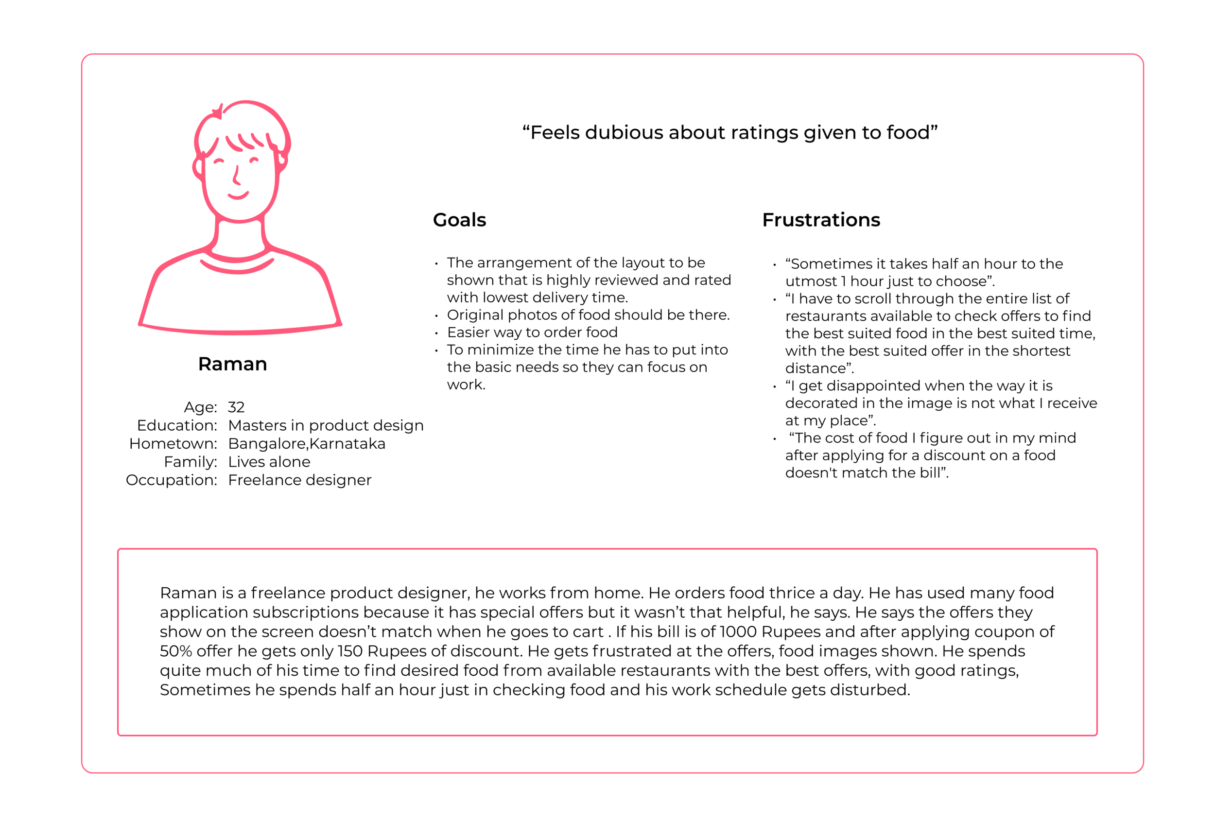
Raman is a busy working adult who needs a quick and easy way to order quality food with reliable food offers because he spends too much time in meal planning and that isn’t good use of his time.
User Journey Map
Mapping Raman’s user journey revealed how helpful it would be for users to have access to a dedicated S.W.A.T. food review app
Starting the design
Paper Wireframes
For the home screen, I prioritized a quick and easy ordering process to help users save time.
Stars were used to mark the elements of each sketch that would be used in the initial digital wireframes
Taking the time to draft iterations of each screen of the app on paper ensured that the elements that made it to digital wireframes would be well-suited to address user pain points.
Digital Wireframes
As the initial design phase continued, I made sure to base screen designs on feedback and findings from the user research.
Easy navigation was a key user need to address in the designs in addition to equipping the app to work with assistive technologies.
Usability Study Findings
I conducted two rounds of usability studies. Findings from the first study helped guide the designs from wireframes to mockups. The second study used a high-fidelity prototype and revealed what aspects of the mockups needed refining.
Round 1 Findings
Users need more information about the use of buttons.
Users want better cues for the steps required to edit the address.
Users need a more intuitive way to access the reviews.
Round 2 Findings
Users found it confusing to add food to the basket.
Users found it frustrating to search for veg food items.
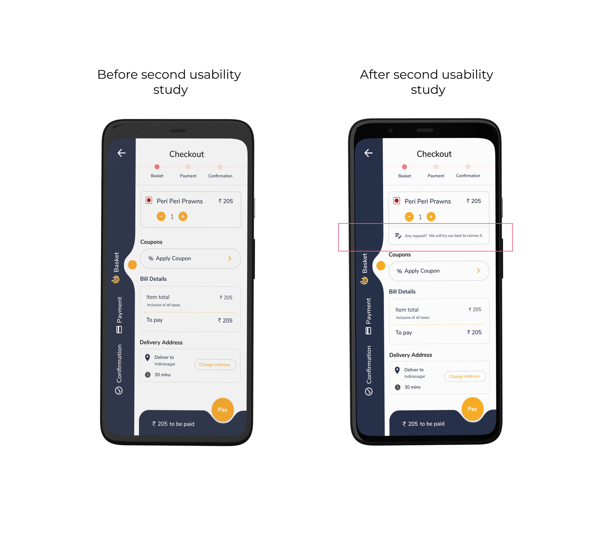
Users need a way to request with the order.
Users need more information about the Milestone feature.
Refining the Design
Mockups
After the usability studies, I added address information on the home screen to edit or view the location. I also revised the design so users see all the necessary information when they first land on the screen.
Usability study revealed that users want to see reviews on the food info page.
After the usability studies, I added necessary information under sections to make it easy for users to navigate.
The first usability study revealed the frustration of not being able to see many reviews at once.
The second usability study revealed confusion about adding a food item to the basket when the user presses the ‘ + ’ icon on the homepage. I changed the icon to ‘ > ’. This icon will let users view food information and buy food.
In the Second usability study users suggested if there could be any way to request with the order. I added an option where users can write their requests.
The second usability study revealed frustration with searching for veg food items. I added an option saying “Veg only“ to find vegetarian food.
In the Second usability study, users wondered what the milestone is. I added a dialog box to prompt the users for information. This will appear the first time to let users know about the feature. They could also view the information by clicking the upper right icon.
Accessibility considerations
1. Screen readers
Provided access to users who are vision-impaired through adding alt text to images for screen readers.
4. Color Palette
Used accessible color palette.
2. Icons
Used icons to help make navigation easier
3. Images
Using detailed imagery for food items helps all users better understand the designs.
Refined designs
Visual design
Typography and colors
Icons
High-fidelity prototype
The final high-fidelity prototype presented cleaner user flows for reviewing, ordering, navigating, and confirming the order.
Going forward
Takeaways
Impact :
The app makes users feel like S.W.A.T. food truck really thinks about how to meet their needs
One quote from peer feedback:
“Great application. Easy to use. The colors look accessible too.”
One quote from peer feedback:
“Very cool app design. Icons and color choices work very well together.”
Next steps
1. Testing
Conduct another round of usability studies to validate whether the pain points users experienced have been effectively addressed.
What I learned :
While designing the S.W.A.T food review app, I learned that the first ideas for the app are only the beginning of the process. Usability studies and peer feedback influenced each iteration of the app’s designs. I learned how different perspectives can help see the problems in the design and help improve the product.
2. User Research
Conduct more user research to determine any new areas of need.


