Case study:
Healthilicious app and responsive website

Project overview
The problem:
Available cooking recipes apps have limited features and have cluttered designs. People lack food information and difficult to find healthy recipes according to users’ preferences.
The goal:
Design an app that will help adults learn to cook healthier meals based on users' preferences as well as to learn to make recipes with the available ingredients they have.
The product:
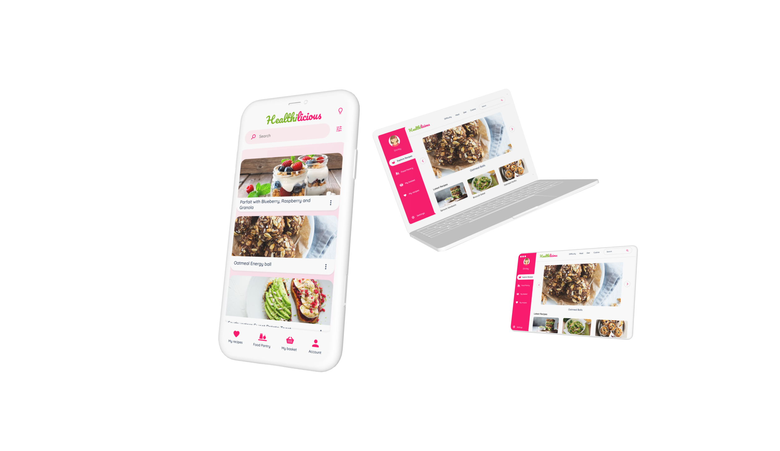
Healthilicious is a mobile cookbook that allows users to learn to cook healthy recipes. Healthilicious’ target users include college students, adults who are concerned about their health, and their family’s health who want to cook healthy food. The goal of Healthilicious is to make cooking fun and easy for all types of users.
My role:
UX designer leading the Healthilicious app and responsive website design from conception to delivery
Responsibilities:
Conducting interviews, paper and digital wireframing, low and high-fidelity prototyping, conducting usability studies, accounting for accessibility, iterating on designs, determining information architecture, and responsive design.
Project duration:
December 2021
Understanding the user
I used data on healthy food and developed interview questions which were then used to conduct user interviews. The users want to cook healthier meals but lack the time necessary to cook and the information about food and their nutrients. Users use various platforms to learn about healthy cooking meals. Users spend much time in meal planning depending upon their and their family's food preferences. The feedback received through research made it very clear that users need an accessible and easy-to-use tool to help guide them.
Personas & problem statements
Bhoomi
Bhoomi is a busy social worker and health enthusiast who needs a quick and easy way to cook healthier meals based on food preferences because she wants to spend less time in healthy meal planning and work worry-free.
Jay
Jay is a busy working adult and a food lover, who needs a way to cook exciting and tasty healthy meals because he enjoys cooking and he wants to make it a part of a routine.
Competitive Audit
An audit of a few competitors’ products provided direction on gaps and opportunities to address with the Healthilicious app.
Ideation
I did a quick ideation exercise to come up with ideas for how to address gaps identified in the competitive audit.
Starting the design
Digital wireframes
After ideating and drafting some paper wireframes, I created the initial designs for the Healthilicious app. These designs focused on easy access to recipes.
Usability study findings
To prepare for testing, I created a low-fidelity prototype which you can view here.
I used this prototype to conduct an unmoderated usability study with 5 participants. Here are the main findings uncovered by the usability study.
1. Navigation
Users need a more intuitive way to access and navigate through the app.
2. Food pantry
Users need better cues for steps are required to create food pantry recipes.
3. Labels and Icons
Users need accessible labels as well as Icons.
Refining the design
Mockups
Based on the insights from the usability studies, I applied design changes like easy access to recipes, providing accessible labels and icons, and provided better cues for food pantry feature.
Additional design changes included adding a clear section on the homepage to provide food information.
And an option to “translate” the food ingredients in the Food pantry for easy access for everyone.
Accessibility considerations
1. Screen readers
Clear labels for interactive elements that can be read by screen readers.
2. IA
The initial focus of the signup process on personalized recommendations helps define the actions for the user.
Refined designs
Sign up process
1. User flow by selecting recipes from the homepage.
2. User flow by using food pantry feature
High-fidelity prototype
The high-fidelity prototype followed the same user flow as the low-fidelity prototype, including design changes made after the usability study.
View the Heathilicious high-fidelity prototype
Responsive Design
Sitemap
With the app designs completed, I started work on designing the responsive website. I used the Healthilicious sitemap to guide the organizational structure of each screen’s design to ensure a cohesive and consistent experience across devices.
Responsive designs
The designs for screen size variation included mobile, tablet, and desktop. I optimized the designs to fit the specific user needs of each device and screen size.
Going forward
Takeaways
Impact:
Users shared that “The app is really useful since we can fill the food items we have at home and see recipes come out of them. That actually helps people learn a variety of healthy recipes as well as who are having food restrictions like they can add their desired ingredients and could learn and cook.”
Next Steps
1. Research
Conduct research on how successful the app is in reaching the goal to help people learn to cook healthy meals.
What I learned:
I learned that even though the problem I was trying to solve was a big one, diligently going through each step of the design process and aligning with specific user needs to be helped me come up with solutions that were both feasible and useful.
2. Features
Identify any additional areas of need and ideate on new features.


